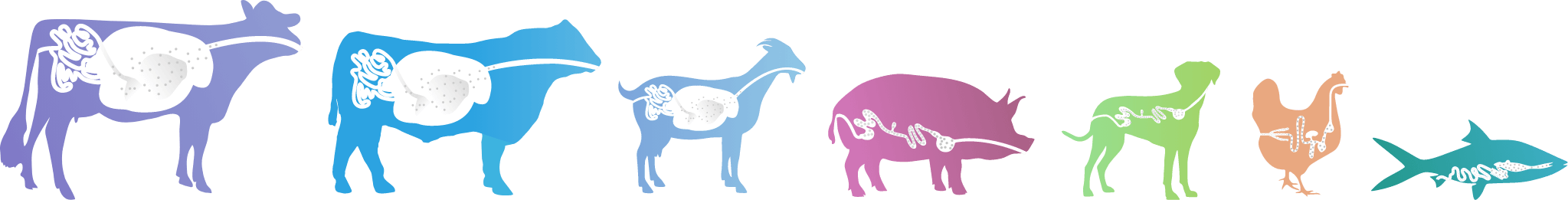
One brand. One identity.

In Jefo, all our communication tools will incorporate the new identity.  It is very important that its use and application be consistent in order for our identity to be clear and strong. 

For Jefo, as a leader in the international animal feed additive industry, our specialized and innovative products and services are developed with great care and integrity.  We are committed to offering the best service, particularly as experts and specialists in

species-specific solutions.

Our corporate identity expresses what we do and how we do it; it consists of an organic design showing our connection and deep understanding of our main areas of expertise: poultry, swine, ruminants, cattle and aquaculture. It shows the care we put into what we do, and the infinite interaction with animals and life around the world. Through the use of a flowing design, together with specific colour themes, our identity places us clearly at the forefront of innovation in animal nutrition. 

This identity incorporates every element of our activities, encapsulating the mission, direction and product range that has made us so successful and amongst the most important players in the international animal feed additive industry.

The logo is the emblematic part of our identity.  It is made up of two elements: the name “Jefo”; and the symbol consisting of four different animal groups together with a hand, representing their interaction and ongoing dialogue.


The hand represents us, our clients and the end consumers of food, and the circle represents the infinite movement and interaction of people and animals.; we all depend on each other. The circle also suggests the world, not only because of our global market and presence, but because we care about our planet.

There are two versions of our logo: the horizontal and the vertical. Their use is defined by the available space and the overall design of the piece.  


Always look for greater impact and legibility, and also for a better balance in the relationship between the design elements.

Logo Restrictions

It is important to present our logo in a clear and non-cluttered environment. Our logo should have legibility and impact not only based on its size and placement, but also in the area that surrounds it.
The area of protection is determined by the width of the hand in our logo.
It is very important to respect the area of protection at all times and ensure that no other element invades this protected space.

Proportion of the logo

Our logo has specific proportions that must be respected. The size of the internal circle of the symbol in the horizontal version is determined by the height of the smaller letters (e and o) of the name. In the vertical version it is determined by the space that runs from the cow’s neck to the chicken’s crest.

Our Tagline

Reason to believe

> Our needs of each species.

> Programs and solutions porfolio of products addresses the specific for real life situations, for life stages & challenges.

> Performance you can trust.

> Science and technology that deliver.

> Support and service that says “easy to do business with”.

Brand Promise

With Logo

Sometimes the logo will need to be used with our tagline, which talks about our essence, history and strategy.  Depending on location, it is possible to use a translation of the tagline, as seen here with the English version as well as the French.

* In the Spanish documentations, the English tagline is used.

Isolated Taglines

The taglines can be used isolated from the logo. In species-specific context, the tagline can be used in the appropriate animal colour. 


The one at the top of this display should be the one in corporate communications.

Our Programs

Programs will come to differentiate us from our competitors, confirming and representing our distinctive savoir-faire and personality.


They provide value-added to both Jefo and its customers. They are a promise of better care for the animals. They designate protocols that lead to better animal health and conditions at specific life stages or reproduction cycles.


* When the programs are use for the Jefo’s employer brand, the colour of the “Care” and “peak” are inversed.

Jefo Matrix Technology

Jefo has patented a technology that encapsulates ingredients in a shielded matrix which protects them from gastric acidity. This encapsulation is targeted for each species and is resistant to damage. It is applied to some of our most important products.

Liquids & Enzymes products

Jefo offers certain products in convenient liquid form. We are also very proud of our family of enzyme products. To highlight these high-quality offerings, we have developed two additional icons. They will most often serve in marketing and sales communications.

Commodities

Jefo has patented a technology that encapsulates ingredients in a shielded matrix which protects them from gastric acidity. This encapsulation is targeted for each species and is resistant to damage. It is applied to some of our most important products.

Produits techniques divers

Jefo has patented a technology that encapsulates ingredients in a shielded matrix which protects them from gastric acidity. This encapsulation is targeted for each species and is resistant to damage. It is applied to some of our most important products.

Our Illustrations

Species Illustrations

Our animal illustrations breath warmth into our brand but also point directly to our species-specific products. They are at once recognizable and whimsical. Their design suggests vitality through healthy digestive systems.


Each specie of animal comes with a variety of positions. Using the possible range allows for a dynamic feel while maintening consistency with the brand identity.

DAIRY COW

Our cow has three possible poses. Apart from the logo pose, the other two can be used to give greater dynamism to presentations or animations, as well as any other application that requires showing more than one cow.

CALF

The calf illustration differs from the one of the more mature bovine because of the thiner body and relatively larger head, typical of younger animals. It uses the same tones of blue as the larger bovine.

BEEF

Our cow has three possible poses. Apart from the logo pose, the other two can be used to give greater dynamism to presentations or animations, as well as any other application that requires showing more than one cow.

SWINE

Our pig has four poses. As with the other animals, use the different versions in a fun way to better express the essence of your message.

POULTRY

Our chicken has three positions plus a family of two chicks. Using them together permits the narration of a story and indicates the healthy development of chickens thanks to our nutrients. They may be used individually or in groups in any of our applications.

AQUACULTURE

There are four versions of our fish, as shown here, each of which show dynamism and movement both in the water or jumping out of it and slashing drops of water on the way. Our fish can be rotated by up to 45˚

Our shrimp has three poses. It should be used below a horizon line to show that it is in the water.

Jefo Matrix Technology Illustrations

Our Jefo Matrix Technology products offer three important advantages. They are: shielded, targeted and safeguarded.


The illustrations on this page and those on the following ones help show how our products are safeguarded and shielded. They are intended for teaching and marketing pruposes.

Digestive Target Illustrations

Our Jefo Matrix Technology products offer three important advantages. They are: shielded, targeted and safeguarded.


The illustrations on this page and those on the following ones help show how our products are safeguarded and shielded. They are intended for teaching and marketing pruposes.

Looped Lines

It is important to note that all our animals are united by the black line.
We have developed some looped lines to help make presentations and other forms of communications feel more whimsical.


Our looped lines should be adjusted based on context, using their potential for colour to emphasize our species-specific message. To keep them elegant and clean, only use colour in the loops themselves.
These elements are perfect to bring a playful touch into presentations and covers.

Our Illustrations

Corporative Fonts

One of the elements that help us most in creating consistency in the use of an identity is the typography.


Our identity has to compete in a saturated market and in order to distinguish ourselves we opted for a new typography that is simple yet modern, very clear and, above all, easy to read.


The versatile typography Verlag was inspired by Guggenheim’s iconic Art Deco lettering. While stylish it is also functional and fulfills the needs for our identity and should be used for texts.

When there is a need to share information with those who do not have access to our corporate typographies, the generic font Trebuchet MS should be used for headings.

The typography DTL Elzevir has a classical humanist design, and is ideal for reflecting our services. It is to be used only for the word “Jefo” in printed and digital applications. When this font is not available, use the generic font Georgia.

Script Font

The True North Script font has been made to look more natural with slight differences in each letter, as in real hand writing.


It serves for the tagline and the programs but also to show an emotion. It must not be used excessively.


* Waiting to have a custom-made script font, we have to trace each word to make them more fluid.

Digital Fonts

The Chivo font is used for all our landing page.


The strength of Chivo Black makes it ideal for highlights and headlines. Chivo Regular’s elegance makes it ideal for combining with the strength of Chivo Black for continuous reading. Its design details make it an indispensable ally for any designer.

We also use the Poppins font, a geometric sans serif typefaces, and Source Sans Pro font, a sans serif typeface intended to work will in user interfaces.

Our Colours

Use of colours

Our identity is characterized by innovation and specialization, representing our diversity of products. The colour themes for each of the animals used individually and together in our identity fulfill two functions.


The first underscores the brand name of Jefo as specialized and consistent, through the use of different ranges of colours for each animal.


The second generates a specific dynamic personality for each of the product lines.

In both functions, the use of the white background with the black horizon line are fundamental to the success of our brand name and identity. For this reason, the correct use of the colours is essential and this manual aims to help you with every application.


Each animal is defined by a logical structure of colour, which indicates the type of animal and colours related to the species and its products. The colours are applied to specific parts of the animal, some internal, others external, underlining the importance of good animal nutrition which is our business.

Dans le but de respecter la charte graphique et d’assurer une uniformité avec l’ensemble de la documentation de la compagnie, plusieurs gabarits ont été créé. En voici quelque uns :

Voici également quelques liens utilies pour démontrer visuellement l’application de la charte dans divers projets :

Did not find what you were looking for? Contact us.